2/09/23
WRITTEN BY HAZEL IMOGEN, FOUNDER & CREATIVE DIRECTOR
Burberry is known for its classic and timeless fashion, from its iconic trench coats to its distinctive English style. One aspect of Burberry we’re all looking at right now is the fresh rebrand led by creative director Daniel Lee.
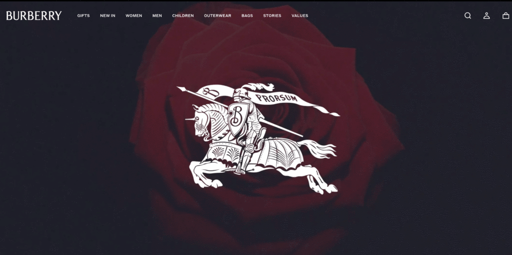
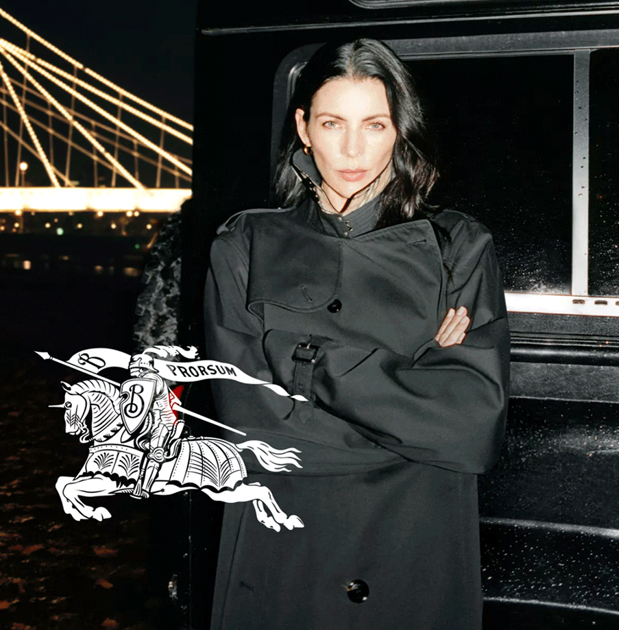
Recently, Daniel Lee reimagined the Burberry logo as part of a major rebrand across all of the brand’s products and stores. This latest iteration brings together aspects from previous versions of the logo, including the distinctive Thomas Burberry monogram with modern typeface. In addition to this redesigned logo, Lee also ushered in a new style of photography and design which draws inspiration from the brand’s British heritage.
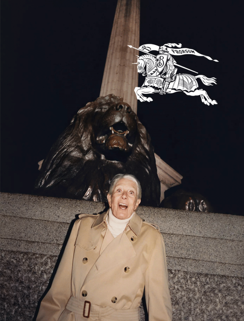
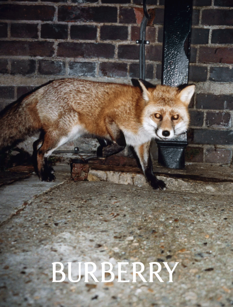
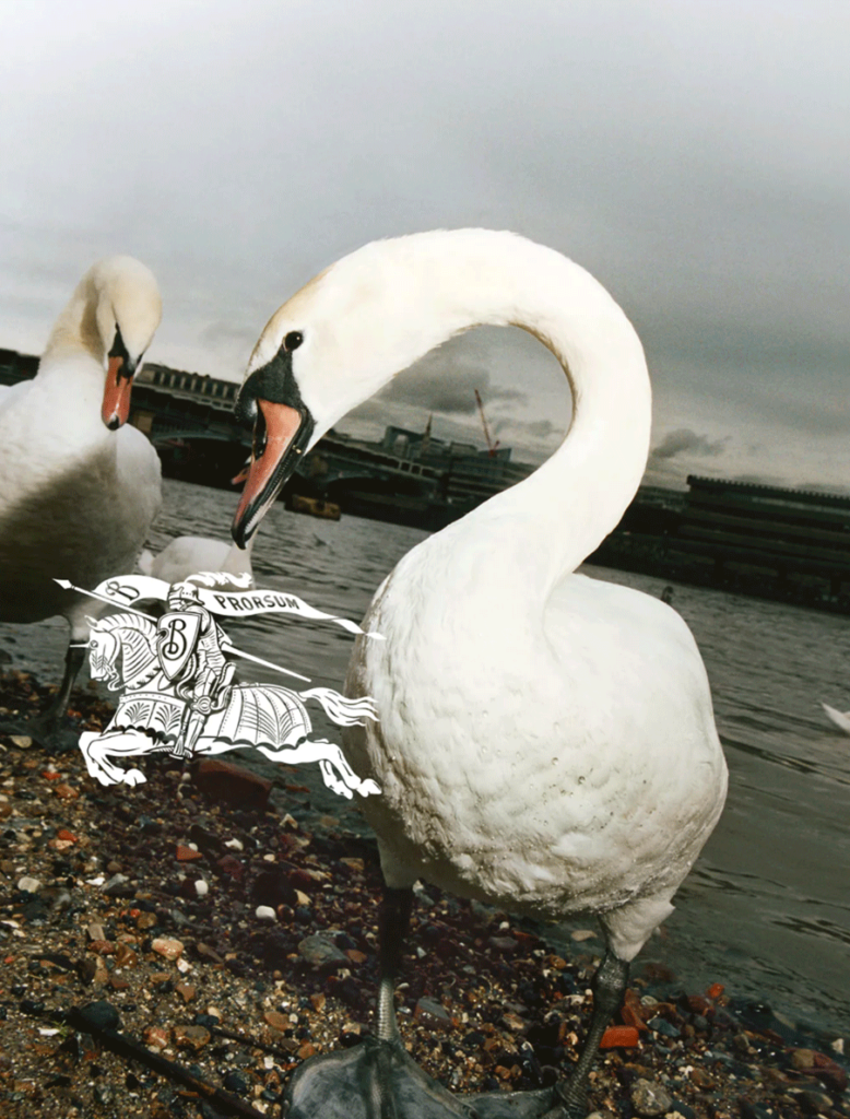
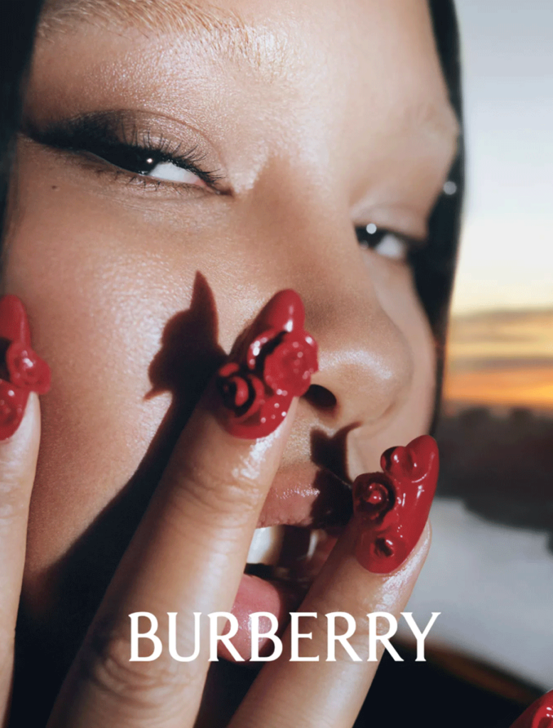
The updated look features bold yet refined visuals that bring to life everyday moments in extraordinary ways. This is best represented through evocative imagery like outdoor portraits and dynamic studio shots that capture everything from surprise foxes to up close and personal portraits. All these elements come together to create a cohesive visual identity for Burberry that reflects both its past and its future.
This exciting update comes following a predictable 2009 brand refresh trend where many high end brands were pushing their logo to a more minimal and simplified look. In this update they removed any depiction of a knight and simplified aspects of the lettering associated with the Thomas Burberry monogram. The result was a clean, more modern-looking logo – but one that too many fashion brands were leaning into and became pretty boring (and lost in the sauce).
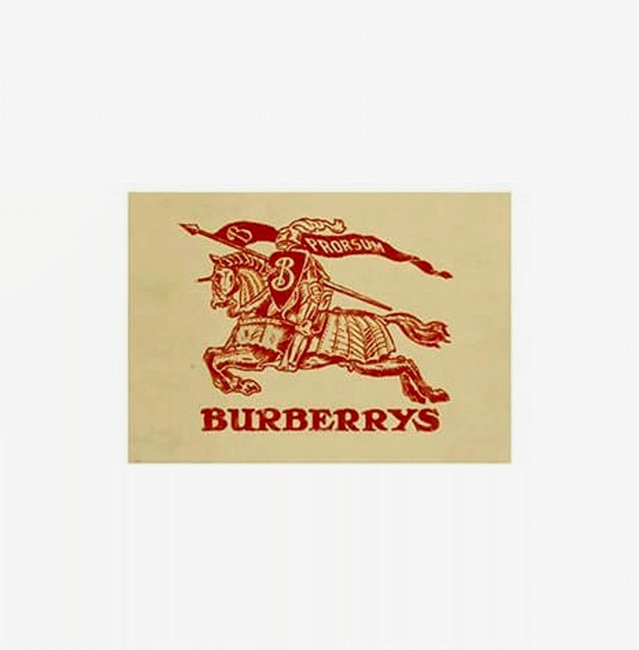
Not surprisingly, the logo has gone through a number of changes over the years in an effort to keep up with the times and remain relevant. Most of these transformations have stayed somewhat true to the original design elements introduced by founder Thomas Burberry when he founded his namesake company in 1856.
Ultimately, each version of this emblem reflects both who Burberry is today as well as where it came from two centuries ago – all culminating into one timeless branding element that conjures up images of luxury and refinement whenever it appears on clothing or accessories!
What we love about the new rebrand is that the logo is not too dissimilar from the original. With a few touchups and a new angle on the other parts of the brand outside of the logo, the brand feels fresh, unique and worth talking about. A brand “refresh” can work in a similar way. While keeping a lot of the originality, a refresh can push a brand just that little bit further to feel a little more relevant and up to-date. Think your business may need a refresh? Reach out let’s chat about it!
WRITTEN BY HAZEL IMOGEN, FOUNDER & CREATIVE DIRECTOR